ALCOVE — DESIGN SYSTEM
01 / 2026
Rooms that hold their silence
01 / PALETTE
Five warm neutrals. No accent colour.
Emphasis comes from contrast, scale and space. The five foundation colours stay fixed; semantic styles map them to light and dark roles across canvas, type, borders and actions.
Milk
#FBF7F4
Oat
#E5DED2
Taupe
#A39382
Mocha
#685D54
Charcoal
#232323
02 / TYPOGRAPHY
Type as structure
Fraunces carries the single serif moment in each view. Archivo handles narrative, metadata and every interface decision.
Rooms that hold their silence
Material before ornament
A house on the headland
The brief asked for a house that would disappear into the hillside and reappear as light in the evening. We began, as always, by removing everything the rooms did not need.
BODY · ARCHIVO 17 / 28
Oak, lime plaster and brushed stainless steel form the whole material palette. Storage is drawn into the thickness of the walls, so each room keeps a single clear gesture.
EYEBROW / META · ARCHIVO 12 / 16 · 0.14EM
2024 · NOTTING HILL, LONDON · FULL RENOVATION
03 / RULES OF THE HOUSE
One book, every page
Constraints create the recognisable voice. They protect the work from decoration and keep new pages coherent as the studio grows.
01
Square corners, always
No rounded cards, pills or soft containers. Geometry stays precise and architectural.
02
Separate with a hairline
One-pixel warm-grey rules define rhythm. Background changes are reserved for genuine chapter breaks.
03
Never decorate the image
No filters, frames or overlays. Only a restrained hero scrim may protect legibility.
04
One serif moment per view
The heading carries the editorial voice. Supporting copy and interface text stay quiet in Archivo.
05
Metadata stays muted
Uppercase, 0.14em tracking and a compact 0.75rem size. Never louder than the work.
06
Space is part of the composition
Allow six to nine rem between ideas on desktop. Density should come from information, never compression.
04 / GALLERY GRAMMAR
Four layouts, one quiet rhythm
Editors choose a layout per image. The page remains considered whether a project contains four photographs or forty.

Full bleed — Edge-to-edge plate. Use for the frames that carry the whole room.
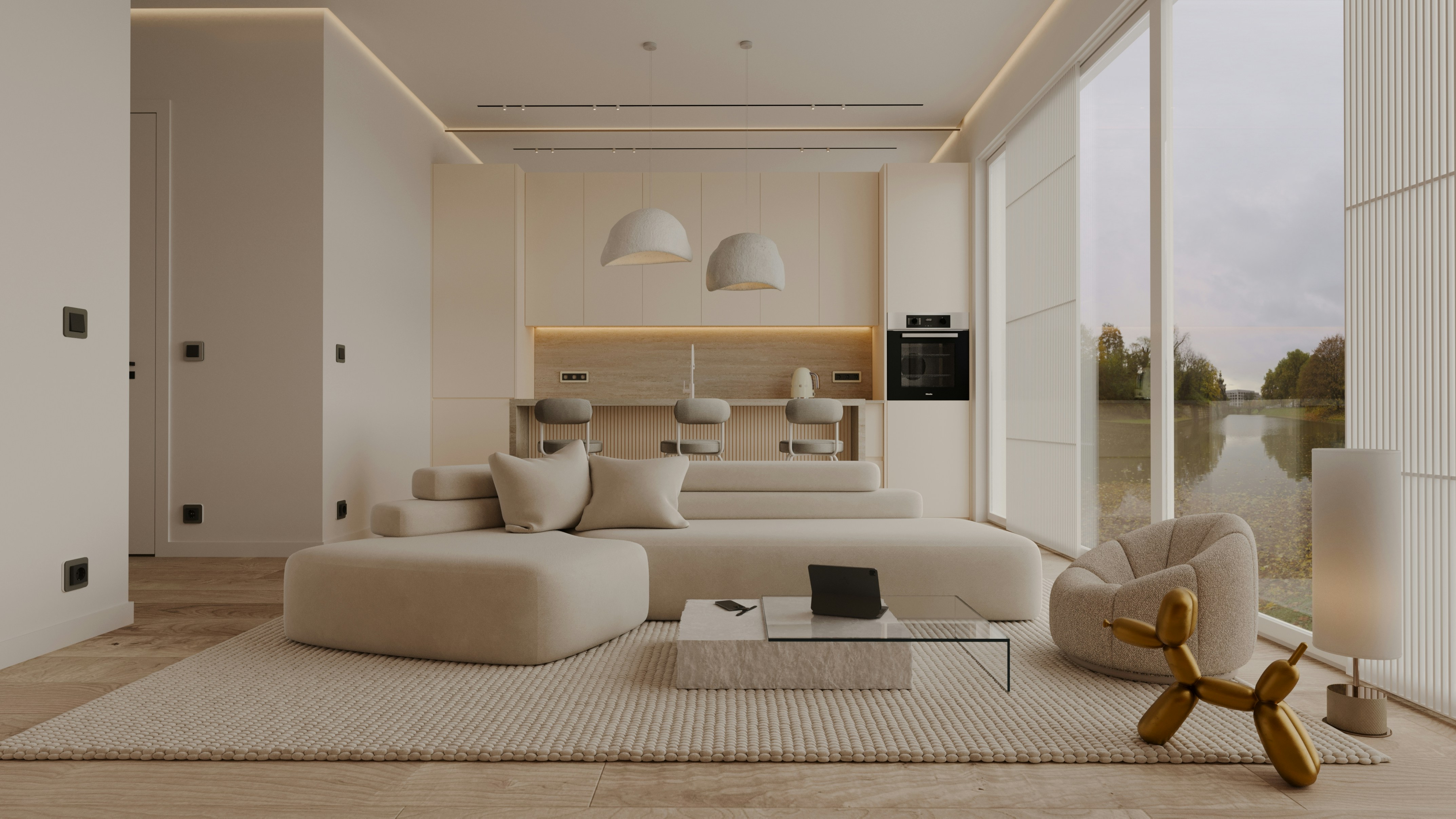

Two-up — Two consecutive landscape images share a row: wide and close, before and after, day and night.


Portrait pair — Vertical details sit side by side and slightly inset, preserving height without overwhelming the narrative.

Local stone frames the Atlantic light.
04 / 04
05 / MOTION
Weighted, never busy
Movement should feel like turning a heavy page: deliberate, quiet and almost slower than expected.
01
Slow fade-and-rise
Use a restrained 18px lift and a long easing curve. Never spring.
02
Gentle plate drift
Reserve parallax for full-bleed images and keep the movement barely perceptible.
03
Stillness is a feature
No bounce, spin, elastic transitions or decorative loops. Let the work remain still.
06 / INTERFACE
Quiet controls, clear intent
FORM FIELDS
07 / SITE SHELL
A quiet frame around every page
Navigation opens the book; the footer closes it. Both are shared through one responsive layout template so editors only update them once.
SHARED HEADER · RESPONSIVE · MENU STATE
SHARED FOOTER · INVERSE SURFACE · EDIT ONCE
08 / ICONOGRAPHY
One family. One considered line.
Lucide is Alcove’s only icon family, authored through IconStack and kept native in Framer. Use a 1.5px signature stroke for the interface, keep colour semantic, and let the surrounding type remain the louder voice.
HAIRLINE · 1PX
FINE · 1.25PX
SIGNATURE · 1.5PX
MEDIUM · 1.75PX
STRONG · 2PX
DISPLAY · 2.5PX
CORE INTERFACE SET
A practical Lucide set for navigation, project browsing, forms, contact details and system feedback. Every icon is a native Framer node, remains editable, and follows the same 1.5px signature stroke.
ARROW UP RIGHT
ARROW RIGHT
ARROW LEFT
PLUS
MINUS
CLOSE
MENU
SEARCH
FILTER
LOCATION
CALENDAR
TIME
SUCCESS
WARNING
ERROR
INFO
PHONE
USER
INTERFACE
Use the 1.5px signature stroke at 16–24px for navigation, controls and functional cues.
EDITORIAL
Use 1–1.25px strokes at larger sizes when the icon acts as quiet editorial notation.
EMPHASIS
Use 1.75–2.5px strokes only for selected states, key actions or rare moments of focus. Lucide remains outline-led throughout.
09 / STATUS COLOURS
Signals without shouting.
Four muted semantic colours extend the neutral foundation only when the interface needs to communicate state. Each adapts for light and dark mode.
SUCCESS
Confirmation · availability · completed
WARNING
Attention · pending · limited
ERROR
Failure · invalid · destructive
INFO
Guidance · context · neutral notice
RULE
Status colour never carries meaning alone. Pair it with clear copy and, where useful, the matching Phosphor icon.
ALCOVE — PRINCIPLE 01
Material before ornament
A system for interiors, architecture and the spaces between.